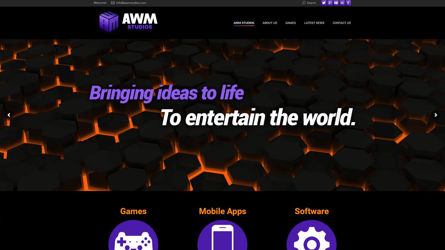
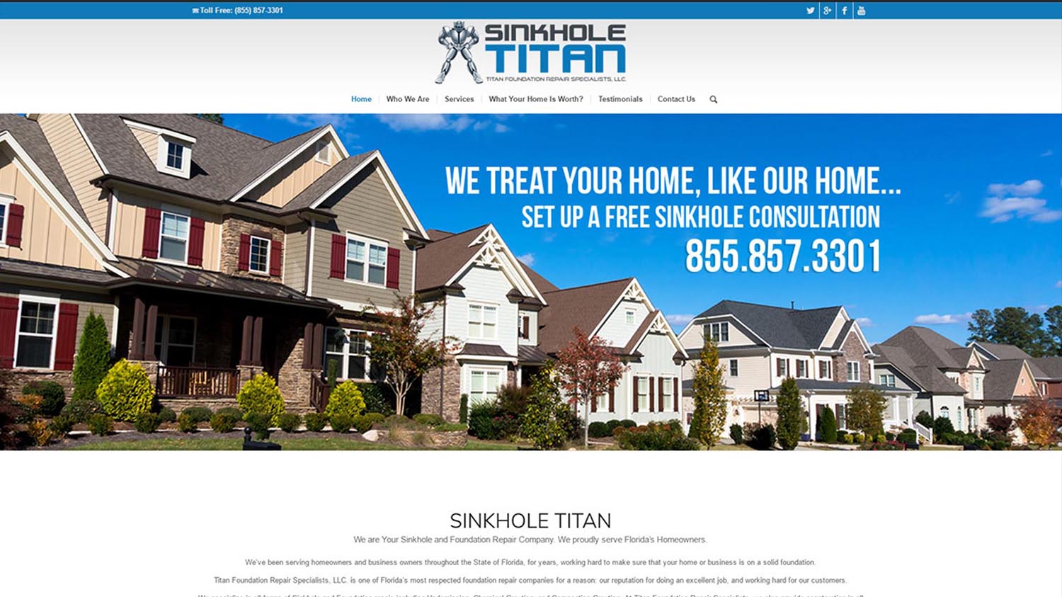
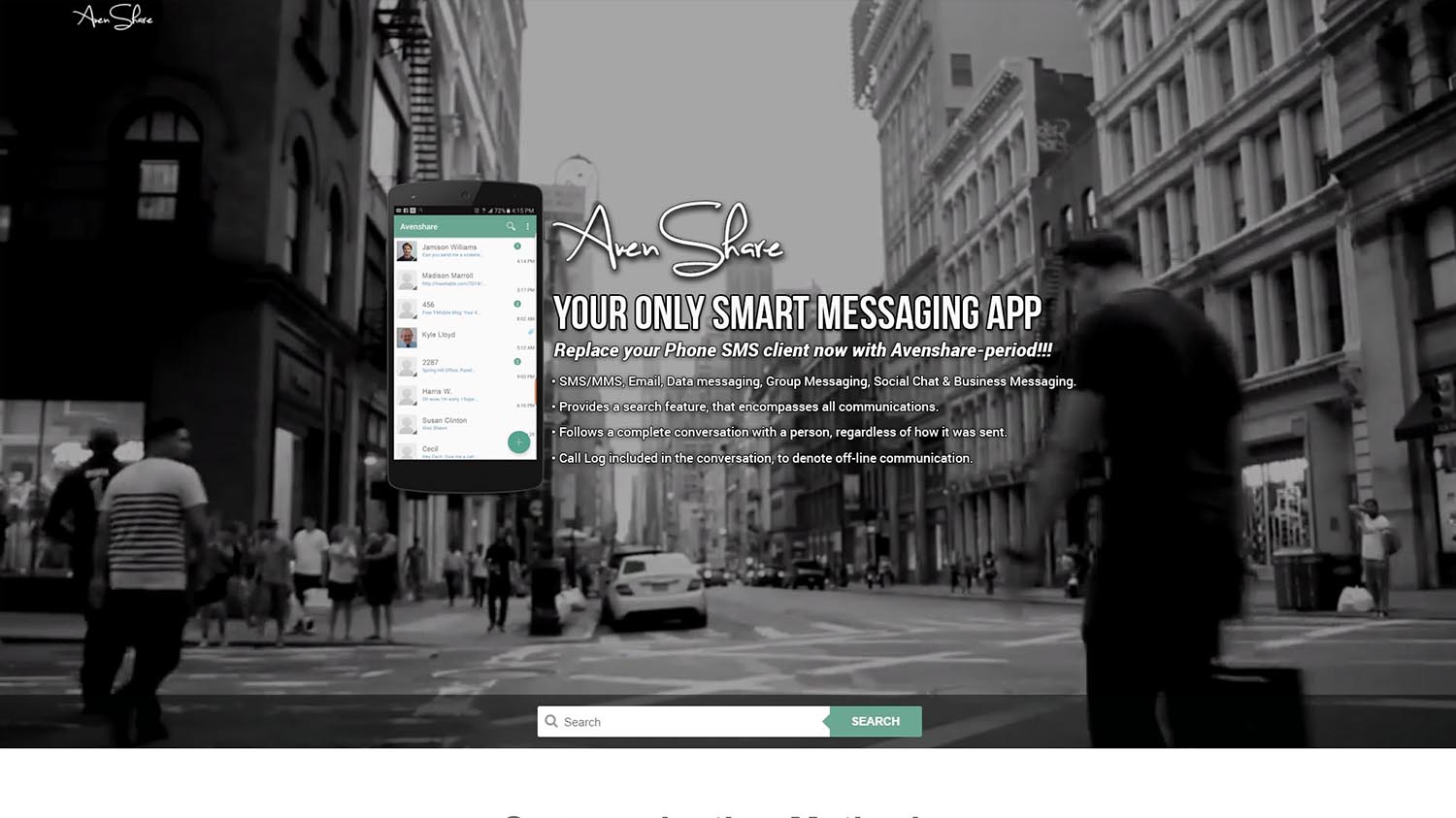
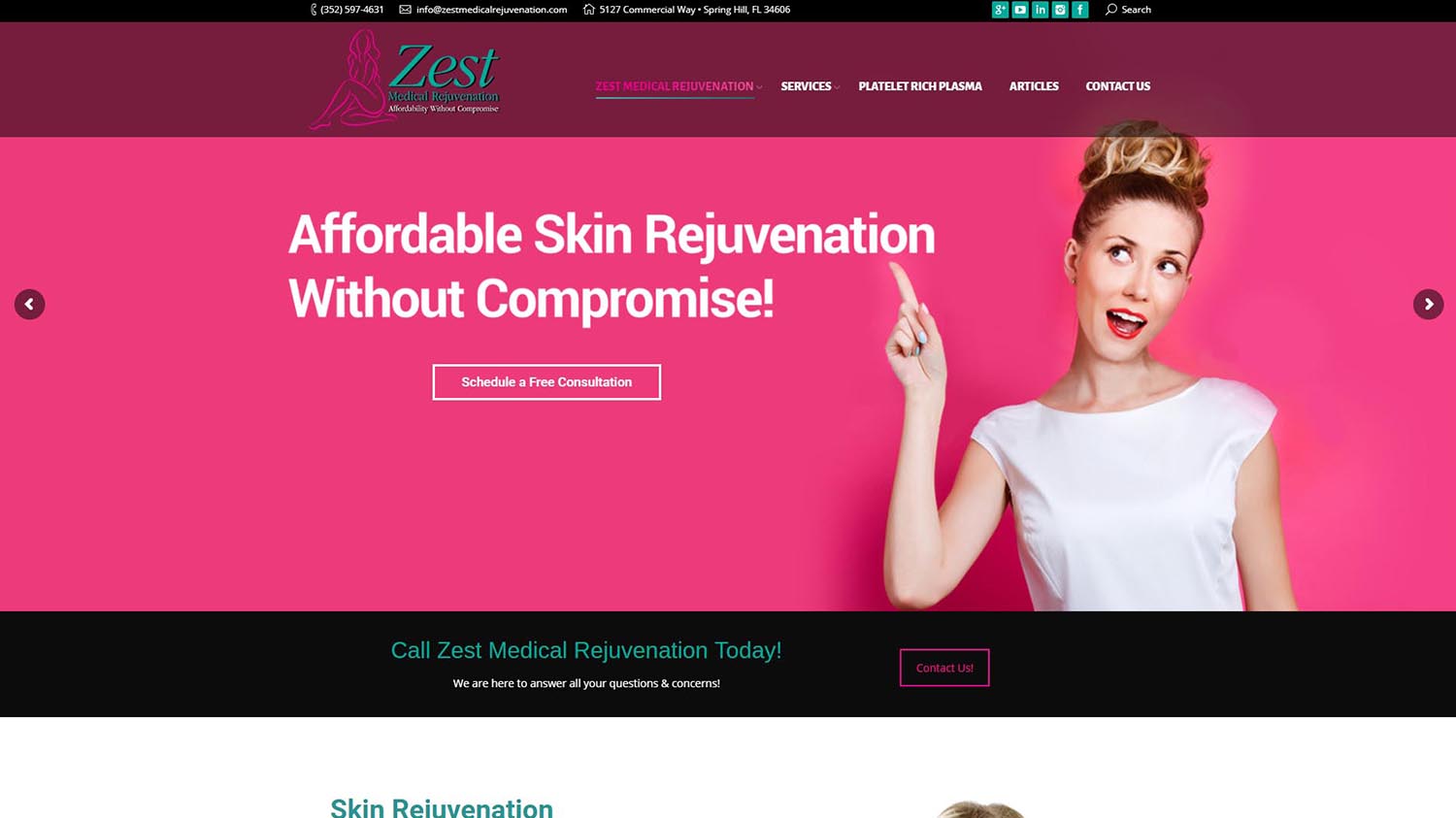
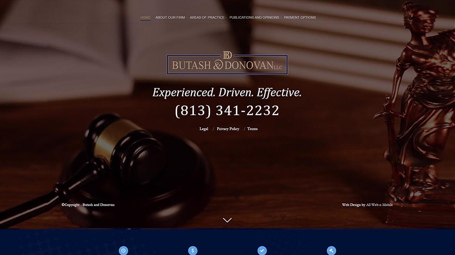
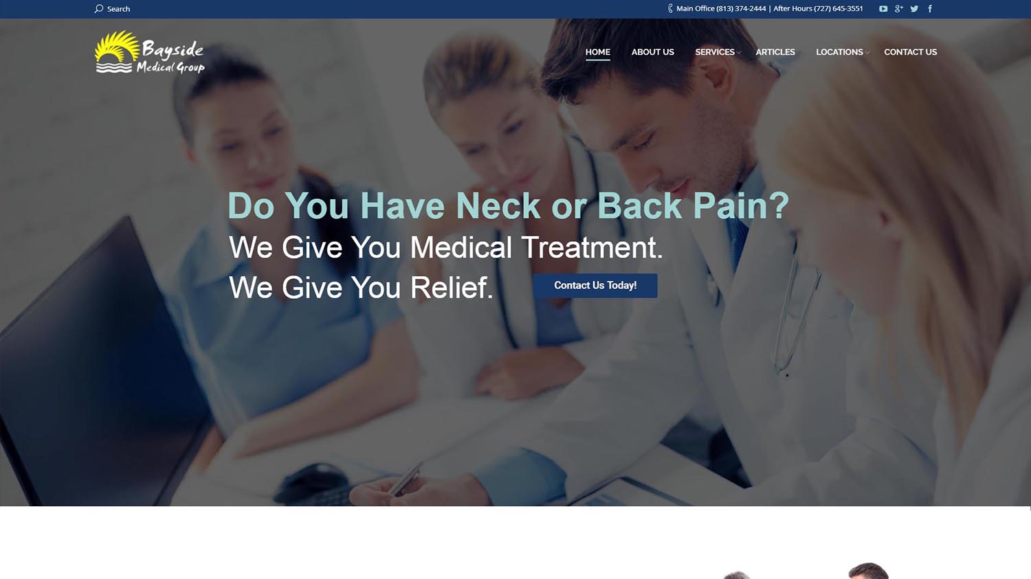
Click on a preview of our web designs below, you then will be able to view the full web page!
Web Design Breakdown:
Take a look below to further learn about the detail we put into our website designs, and how having All Web-n-Mobile design your site can help your business grow!
SLIDESHOW
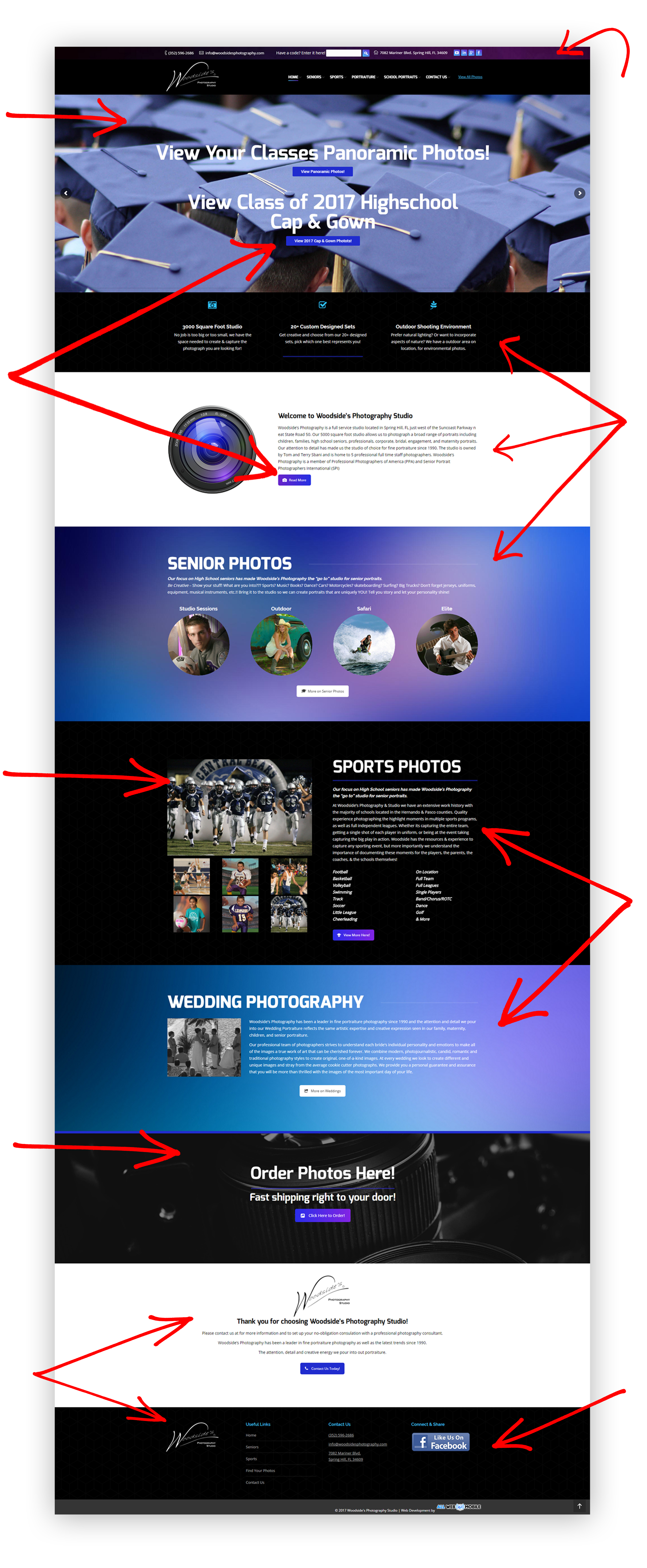
You want to make a good first impression with a new viewer. By having a animated slideshow, it will instantly grab their attention, with quality images, slogans and/or sale pitches. Having multiple slides to click thru will not only keep the viewer engaged, but will give you a chance to showcase your products & services in a creative & interactive way.
ANIMATED BUTTONS
Having a button fly in as you scroll down thats links to another page will not only grab a viewers attention but will increase the chances of them exploring further into you website. The longer they are on your site the higher the chance of them contacting you for a service.
PHOTO GALLERY
A picture is worth 1000 words, by offering your viewers a photo gallery is a perfect, interactive way to show them past projects, showcasingproducts, display a portfolio, and give authentic examples of your work and/or services. In hopes to impress them enough and make that big potential sale!
PARALLAX BACKGROUNDS
This is the latest trend in web design, “parallax” which is having beautiful images as a background that are in motion at a different speed as you scroll. This is the x-factor that will set you aside from the “norm”. It gives a deep, submersive experience, and leaves visitors with something to remember your site by. Because if they’re not buying today they will tomorrow, so when that time comes, you want your business to come to mind when their ready.
BRAND REINFORCEMENT
By the time they’ve scrolled to the bottom, at the very least you want the viewer to not just be familar, but accurately informed about you, your company and what services you offer. Displaying your logo in multiple areas, and dispalaying your business’s name often thru out the content, will slowly but surely make the visitor more & more comfortable with your business.
CUSTOM TOP BAR
Being the first thing you see, it is perfect for adding phone numbers, address’s, social links, emails, & more. All numbers are clickable on mobile, so all a customer has to do is click the number and it will instantly dial it in there phone. Click the address and it will open in google maps, and the email will open up a new message for them to compose, intuitive & user friendly
CREATIVE LAYOUTS
Constantly introducing new ways to display content by changing the background color, text color, & adding pictures, will not only keep the viewer engaged longer, but will add to the overall depth of the website. Each area will feel like a new page , leaving no chance for potential customer to feel bored and leave to another site.
MORE CONTENT, PLEASE!
Displaying as much optimized content as possible will not only increase the time a visitor will spend on your website. But will maximize your SEO. When someone search’s on google for a service, google displays the one with the most unique content. Assuming you must be the expert in this field. Displaying too little optimized information could be the difference of a potential client clicking on your page or one of your local competitors.
POPULATED FOOTER
Now when they have scrolled to the bottom of the homepage you don’t want them leaving just yet, by displaying links to other pages of yours, it will keep them engaged on your site longer, exploring thru your servcies, and getting more comfortable with your brand. By displaying your contact information on the bottom it gives one last chance for them to hopefully give you a call or inquire about a service, in efforts to increase the chance of making a sale!


